Art 3 is the year when my artist voice really began to develop. After skipping Art 1 and going straight into Art 2, I felt overwhelmed by it all. I tried to keep up with my class and struggled when my technical abilities didn't match up with everyone else's and weren't at the level I wanted them to be. In Art 3, I began to focus more on myself, what my strengths are, and what I need to improve on. I realized I couldn't be good at everything but instead had to focus on a few aspects of art that I'm either good at or want to work on. When the concept of having an "artist voice" was brought up, I had no idea what mine was at first. Not only do I have to draw well...I have to represent my voice through it? At first, it seemed impossible. As I moved through the year, my voice began to show itself in my work. I still have a long way to go, especially with IB art coming up next year. I don't think an artist ever 100% knows their own voice or what their own artwork means but at some point, you get a pretty good idea and just stick with it. My voice is seen in my realistic drawings with some graphic design elements (like the triptych, window drawing, MLK drawing...). I still don't know what my artist mission is or what I'm trying to do with art later on, but it has a significant place in my busy life. I can relax and ease my stress by drawing but it also can add on to my stress because of my constant desire to be the best.
This year, I learned what a multifigure complex composition is. In the past, I've done simple drawings and thought it was enough but I now know that a real painting or drawing has to have many layers to it and many objects. There needs to be rhythm, color, value, movement, and most importantly a story. Rather than simplistic drawings that look appealing to the eye, my drawings need to be come drawings that look appealing to the eye but are also appealing to the brain and make the viewer think about the story behind it. It's important to keep Art 1 and 2 rules in mind but to also remember that these rules can sometimes be broken. Not every drawing or painting has to look the same, have the same components, or follow the same rules.
My media use has increased and diversified throughout the year. I've experimented with many different mediums but I've also discovered which ones I like best. I know that drawing with pencil will always be my favorite media to use but I have also started painting. I want to improve my painting skills and get them to a level where I can draw complex compositions that tell a story. I was in no rush to learn this in Art 3 because I know IB art is very wet media centered so I have that to look forward to.
In Art 3, my sketchbook has gone from a place with pretty drawings that I can brag about to a place where I can plan my bigger projects and plan out my process. When people ask to see my sketchbook, they are almost always more disappointed than when they see my bigger, finished products. I don't mind because I know that my sketchbook is just somewhere for me to have ideas, not something for other people to be looking at and critiquing. Whenever I'm stuck and don't know what to draw, I look back at my sketchbook for inspiration. A great example of this is when I drew "Polly Wanna Cracker?" and ended up receiving a Gold Key in scholastic for it. I got the idea to draw a parrot by looking back and seeing some rough sketches I had made of parrots a while ago. I then added on to this by adding the words and tested out the colors in my sketchbook as well. The use of my sketchbook has definitely helped me because it shows in my work. My work has improved tremendously and the more research and planning I do before assignments, hopefully the better it will get.
Friday, May 23, 2014
Monday, May 19, 2014
Expressive portrait bust

Triptych Reflection
This is the first triptych I have done and I already love the idea of a triptych. Putting one idea on three canvases and having to unify it through color, design, texture, and composition is a challenge but also an opportunity for creativity. Having the opportunity to do three different paintings but connecting them in the end allows you to tell a story; to tell your story. I did not do a great job in telling a story or showing my contextual understanding in my first triptych but I now recognize the idea behind it. I have many ideas that can tell a story because everything in life tells a story... a triptych allows you to show this story in a variety of ways and the fact that it's chronological makes even more sense to the viewer.
When it comes to composition, I did not necessarily follow the rule of thirds because my Eiffel Tower was centered, however this was what I found best since I was going for the graphic design aspect. In the future, the composition should draw the reader into the triptych and keep them interested in the story and rhythm, rather than just have them look at the triptych like some simple postcard and move on.
Media use gets more complicated the more complicated the idea is. A simple Eiffel Tower only requires a painted acrylic background with a minimal amount of color mixing and a plain white outline of a building. However, when triptychs involve people or other multifigure complex compositions, there needs to be a deeper understanding and more complex use of media.
Work process can be seen in my sketchbook where I originally had ideas for what story my triptych would tell. However, I went on a different path and when it came to my rough draft, I did a graphic design piece instead. This show how easily an artist's thought process can change when it comes to art and how ideas come into your mind at every second. In the future, I can do a better job of documenting these ideas to show my work process.
Overall, I loved doing triptychs. I will definitely look into them more into the future and explore different ways in which I can tell stories and ideas through my triptychs.
Eiffel Tower Triptych

Friday, March 7, 2014
Math Curse - Polly Wanna Cracker?

Monday, February 24, 2014
Crash! Bang!
For this assignment, I was given the words "crash!" and "bang!" and had to create an interesting drawing based off of them. For crash, I decided to draw a plane crash in the ocean because it's a fear that I have since I travel in planes a lot. I chose to do it all in pen since I'm used to drawing in graphite pencil, which ended up taking a very long time. The use of black, red, and blue ink created an interesting color scheme but overall took about 4 hours with all the little details. For "bang!" I was inspired by the Big Bang Theory and decided to draw the solar system. Outer space and the unknown is another fear of mine which I chose to represent. I like my use of value but I wish I had done the drawing in color to make it more interesting. 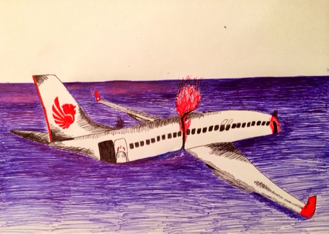

Expressive self portraits
In my first portrait I got too focused on the small details and shading instead of the overall expression of the face. I fixed this mistake by barely shading the next few portraits and focusing on portraying emotion instead. The emotions are (in order) serious, dreamy, surprised, confused, and sad. These expressive self portrait sketches will help me when I'm trying to make clay molds with expressive facial expressions.


Subscribe to:
Comments (Atom)